Mark Dominus (陶敏修)
mjd@plover.com
I have another blog that doesn't suck.
Archive:
| 2023 | JF |
| 2022: | JFMAMJ |
| JASOND | |
| 2021: | JFM |
| 2020: | JFMAMJ |
| JASOND | |
| 2019: | JFMAMJ |
| JASOND | |
| 2018: | JFMAMJ |
| JASOND | |
| 2017: | ND |
Comments disabled
I've been to some crappy conference talks, let me tell you. And usually they're crappy in pretty much the same way: too little substance, delivered too late. (This is what led me to invent lightning talks: if the speaker can't get off their thumb and get to the point, then by God we'll get them off the stage and give it to someone who can.)
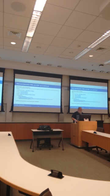
Anyway, this talk was crappy in a whole new way. It was about designing accessible web sites. The speaker put up his first slide and here's what I saw:
I raised my hand. “Excuse me,” I said. “I can't read that. Can you please make the font bigger?”
“Um, no, I can't.”
So I got up and walked out.

