Mark Dominus (陶敏修)
mjd@plover.com
I have another blog that doesn't suck.
Archive:
| 2023 | JF |
| 2022: | JFMAMJ |
| JASOND | |
| 2021: | JFM |
| 2020: | JFMAMJ |
| JASOND | |
| 2019: | JFMAMJ |
| JASOND | |
| 2018: | JFMAMJ |
| JASOND | |
| 2017: | ND |
Comments disabled

My early conference talk slides were unrelievedly dull, just lists of bullet points. After I got better at doing talks, I started adding diagrams and illustrations, then sometimes whimsical jokes or sarcastic comments in the form of illustrations. For example, once, on a slide discussing a blatantly false claim in a certain piece of API documentation, I included, without comment, a picture of Richard Nixon. (If I had it to do over I would use Pinocchio.)

At some point I decided that it was almost always better to have some sort of picture of every slide, just to maintain visual interest. And if I thought about it I often came up with a suitable illustration, but not always. So one year I tried an experiment: have the slide-building software detect slides with no illustration, and automatically insert one at random into the margin.

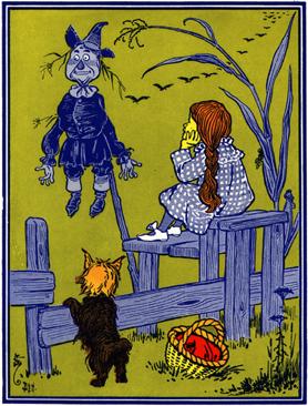
As a committed Dadaist, I expected that this would produce delightful conjunctions of illustration and text, sometimes inane, sometimes perplexing, but every once in a while something amazing, hilarious, or profound that I would not have thought of on my own. The class was Tricks of the Wizards and I gathered W.W. Denslow's spot illustrations from the original 1900 edition of The Wonderful Wizard of Oz.

It didn't work. The random illustrations were just confusing. I never even bothered to test it on a live audience.
